In normal times this week would have seen the opening of a new exhibition at the Pannett Art Gallery, of work by students studying A level at A2 or As level in Fine art and Graphics at Caedmon College. A2 is the full A level and the vast majority of students have followed this qualification.
Not wanting people to miss out on this wonderful display of fabulous creativity the Pannett Art Gallery, working with the staff at Caedmon College, have made a selection of their artwork available on the Pannett Art Gallery website.
“Although everyone at the gallery is extremely sad not to have the opportunity to display and enjoy the vibrant, eclectic and exciting artworks of these young artists, we are delighted to be able to showcase their work on our website” explains Pannett Art Gallery curator Helen Berry.
In this on-line exhibition you can enjoy work by each of the students and read the artist statements provided by three of them.
About the course
Art A level provides students with the opportunity to express themselves creatively, through personal topics very close to their hearts. Inspired by their chosen artists, the students produce a series of art works in both two and three dimensions. They are encouraged to experiment with and use a broad range of media, including paint, printmaking, photography, pastel, charcoal, ceramics, textiles, inks, papier-mâché etc. Students can experiment with different working styles and techniques and this enables them to gain an insight into the artwork of professional artists and craftspeople, both traditional and contemporary. “They never cease to surprise and delight us with their talent, imagination and creativity” said Zoe Brown, Subject Leader for Art at Caedmon College.
Artist statements from three of the students
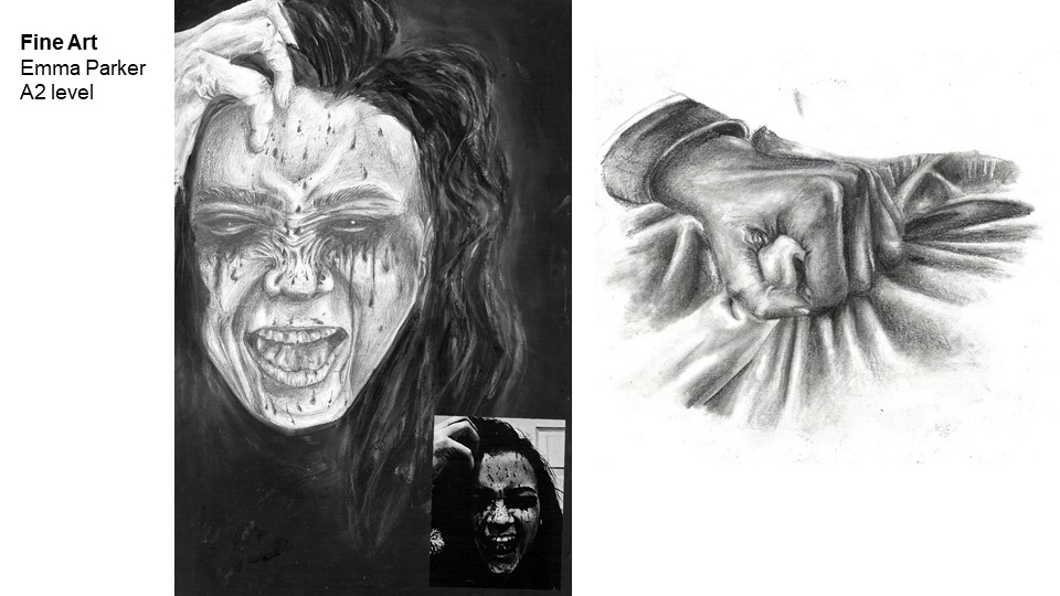
Emma Parker
My A-level artwork has always had a dark, mysterious atmosphere, mostly inspired by night-time emotions and terrors. It is a topic that I have been particularly fascinated about over the past years as I believe that I’ve had several experiences of Sleep paralysis myself. Therefore I was intrigued to research and understand it further.
I particularly enjoyed focusing on figurative expression within my portraiture work. My preferred media in the beginning was dry, pencil and charcoal, however as I progressed throughout the year, I found that I also enjoyed the use of acrylics and mixed media. I used these media to focus on tonal values rather than colour, however incorporated several neutral shades to add further depth and act as a ground .
Creating pieces that involve intricate details and realism has always been a passion and a good example of this can be seen in my hand study from unit 1. Creating this piece allowed me to understand what media I was most skilled at, whilst also enjoying it.
Another piece that I thoroughly enjoyed creating was the illuminated hand in unit 2. It allowed me to stretch my knowledge of acrylic painting and tonal value . I used layering of paint therefore I was able to create a smooth, blendable surface to create the features of the hand.
I investigated the work of several contemporary and historical artists some of whom followed similar themes of terror and extreme emotion. I thoroughly enjoyed studying Guy Denning and Henry Fuseli and found their contrasting styles enabled me to extend my repertoire of skills and visual language. Digital photography has played an essential role in much of my image making process, where it is used for recording observations and experimenting with ideas.
I feel my unit 1 work explores the emotional journey of sleep paralysis, from a scared, paralysed individual, to one of freedom and life.
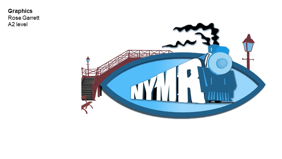
Rose Garrett
For my personal Investigation I focused on the theme of contrast. My initial approach was looking at artists such as Alexa Meade and Joe Lurato, two artists who show contrast in different ways using colour and experimentation. I chose this theme as I felt that it is something that makes a picture really stand out for me, be it contrasting colours or something being out of place and not fitting into their surroundings. Taking the theme of contrast, I explored the feeling of not fitting in and the feeling of generally being out of place. I looked not only at what feeling out of place looks like, but what it feels like to the person experiencing it. This has allowed me to explore, understand and normalise this feeling that so many of us experience at many different times in our lives. Other artists I explored in my work were Andy Warhol and contemporary artist Rone who both enabled me to look at contrasting pallets and the theme of beauty and decay, making the initial theme of contrast less obvious and direct than the work at the beginning of the project.
I then transferred the feeling of not fitting in and being alone to myself and thought in what situation does not fitting in become a positive. For me it was dance.
I took the idea of dance and movement as an expression of how to normalise and celebrate not fitting in. Using inspiration from the Futurist movement and other artists who explore movement and energy within their work. My creative outcome was a series of three photographs, using a low shutter speed so that the movement blurs into one, and a large scale mixed media piece. These images are a representation of how contrasting with the people around you is something to celebrate rather than be shown in a negative light.
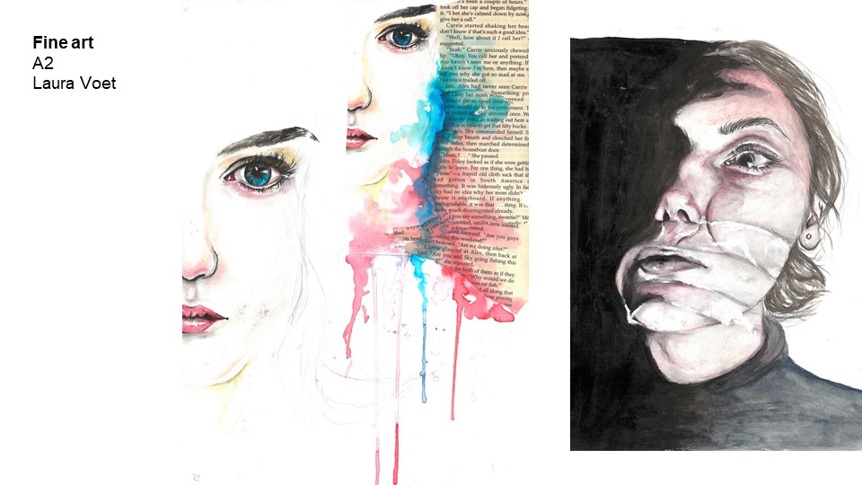
Laura Voet
My work is based around a personal investigation which enabled me to explore a topic of my own choice, which was based on the expression of beauty, body dysmorphia and depression, a subject that’s close to my heart.
It also enabled me to explore many different artists and types of media. I looked at Agnes Cecile, Jenny Saville and Kwang Ho Shin and a couple of others. However, the aforementioned three I chose to mainly focus on and particularly Cecile as she worked with watercolour. This helped me to develop new skills and portray beauty as depicted within her style of work.
Kwang Ho Shin however, is an artist that works with acrylic and charcoal and paints faces almost as though they were wearing a mask. This led me to develop his style into what I viewed as depression and being hidden to the world due to the condition. For example I re-created a piece of his work using acrylics, however to create the thickness of the paint seen within his work, I mixed acrylic with flour which created a thicker consistency to work with to create the rough texture required. I also took inspiration from the way he uses charcoal to create looser, more expressive facial features and used it to portray myself with a charcoal expressive mask. I wanted to leave the eyes exposed however, to show the idea of being masked to hide depression as it is believed that the eyes are the window to the soul and reveal your true feelings.
Jenny Saville inspired me to use distortion of the body to portray body dysmorphia, as she paints faces and parts of the body pressed against glass, creating the illusion of ugly bulges. From these images, I took the inspiration to create my own photography and pieces of practical work. For example I used tape to wrap around my face and body to create bulges and distortion, which I then later painted in both watercolour and graphite. I also explored the idea of her pressed faces against glass and used a photocopier to press my face against to create a similar effect for my artwork.
My final outcome is a mixed media self portrait which uses the influences of all of my artists and, I feel, demonstrates well the difficult subject of body dysmorphia.
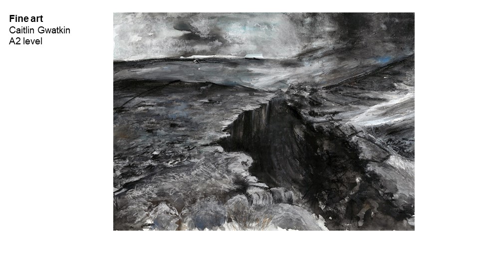
Caitlin Gwatkin
Caitlin Gwatkin
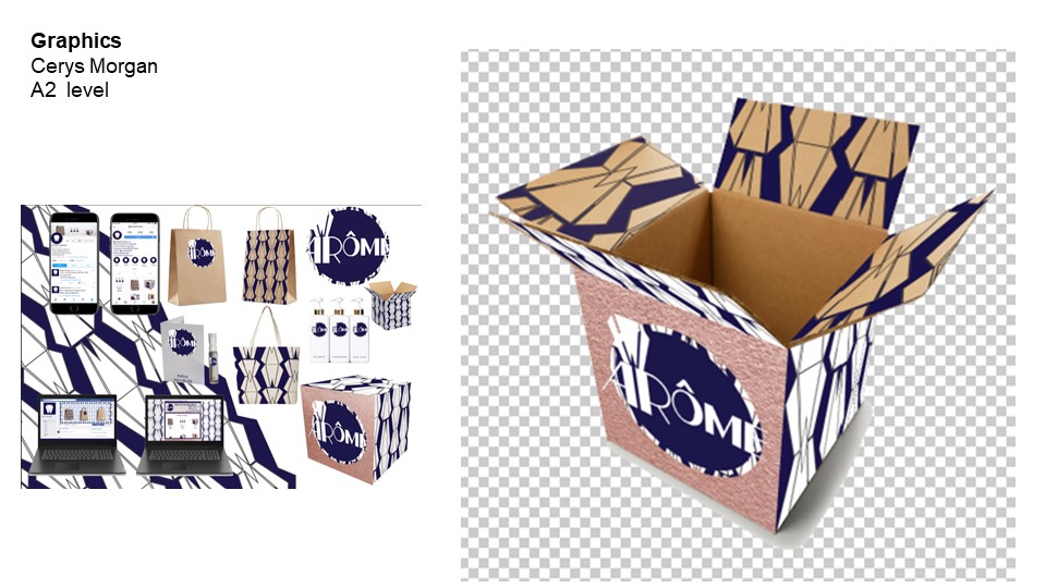
Cerys Morgan 2
Cerys Morgan
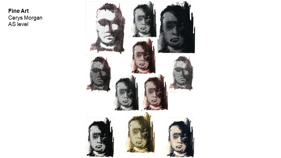
Cerys Morgan
Cerys Morgan
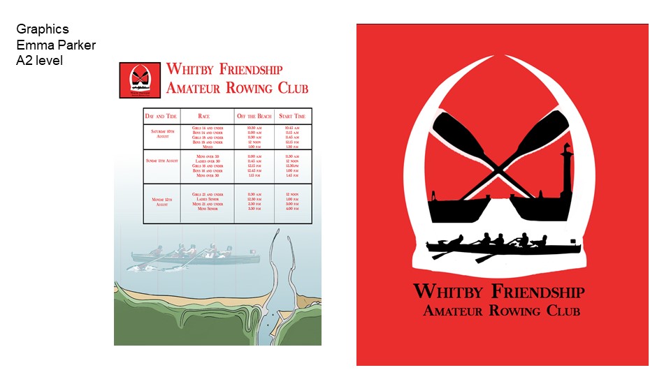
Emma Parker 2
Emma Parker
Emma Parker
Emma Parker
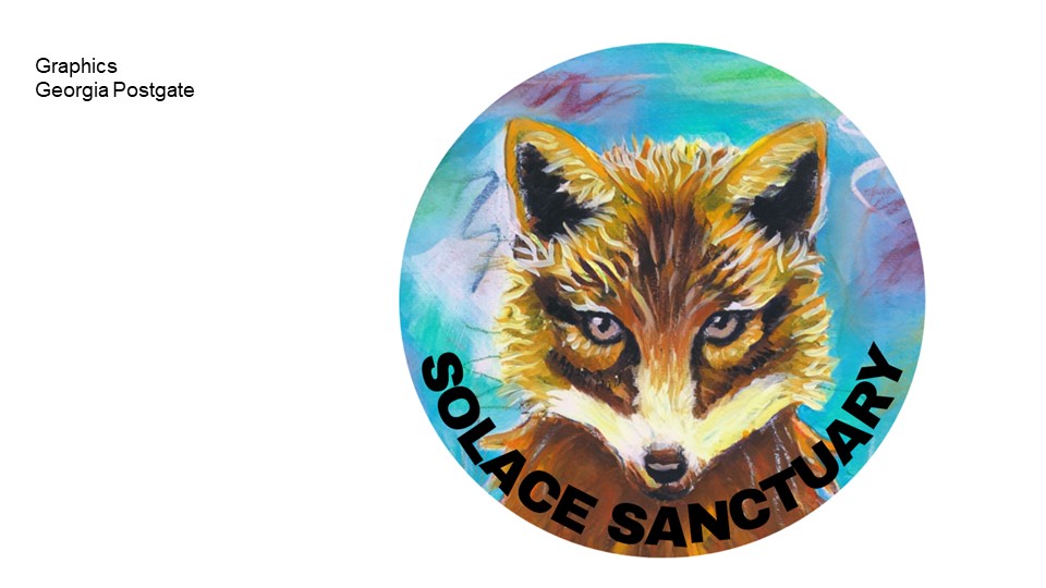
Georgia Postgate
Georgia Postgate
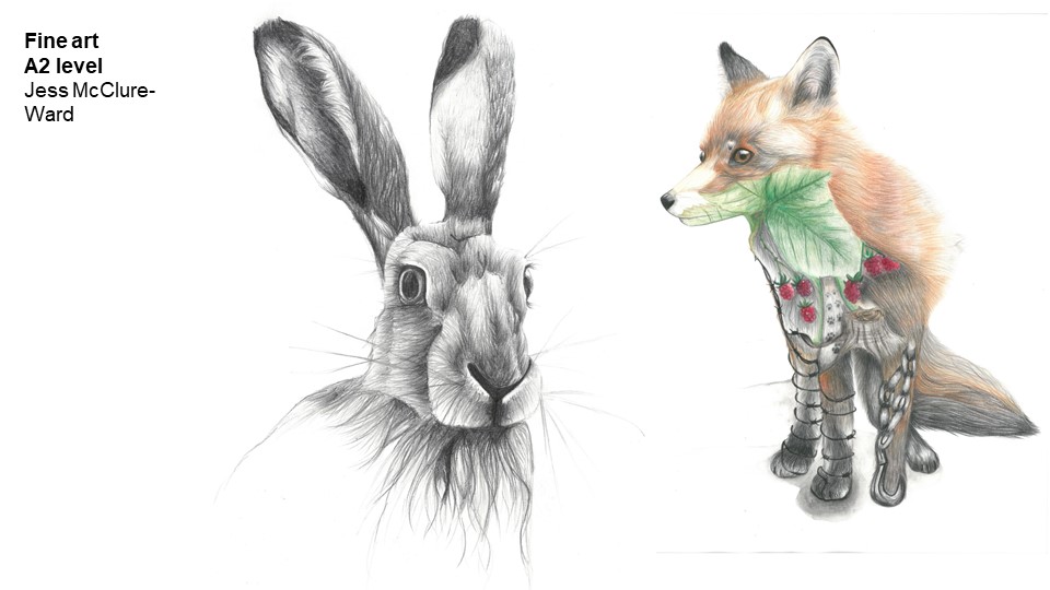
Jess McClure-Ward
Jess McClure-Ward

Joseph Davies
Joseph Davies
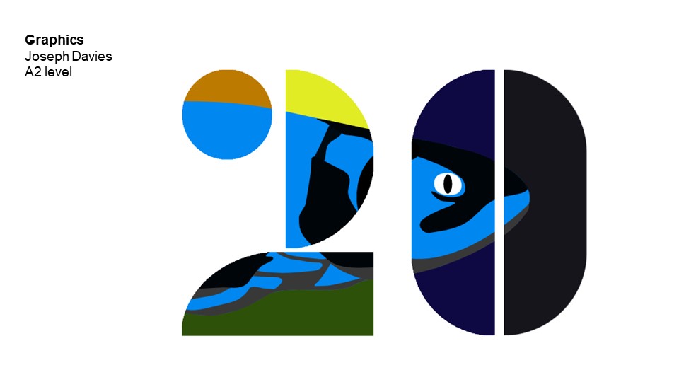
Joseph Davies 2
Joseph Davies
Laura Voet
Laura Voet
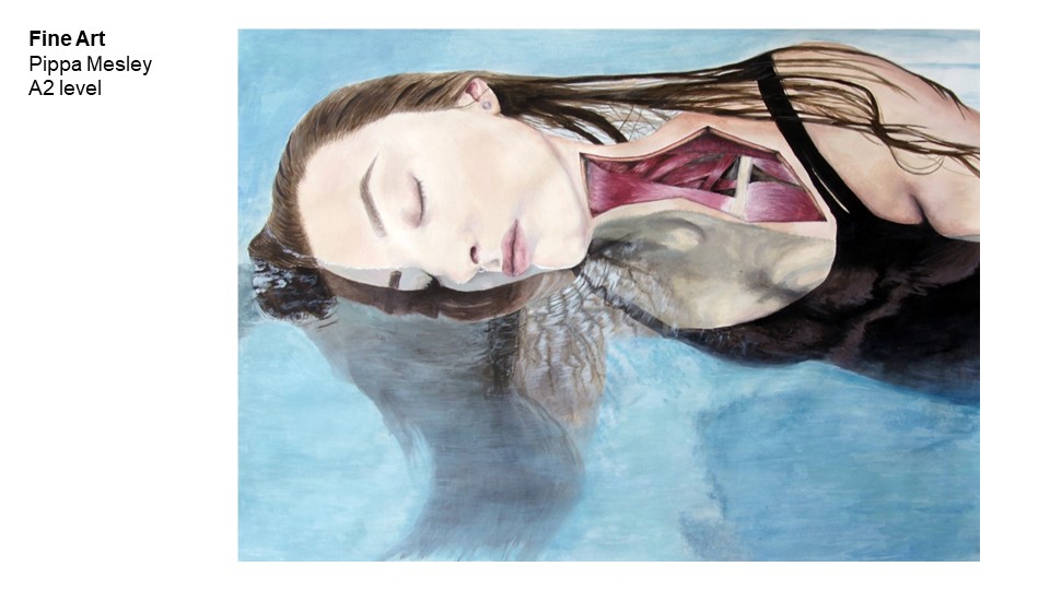
Pippa Mesley
Pippa Mesley
Rose Garrett 2
Rose Garrett

Rose Garrett
Rose Garrett
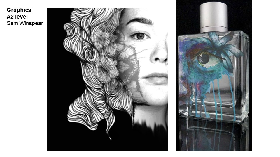
Sam Winspear 2
Sam Winspear
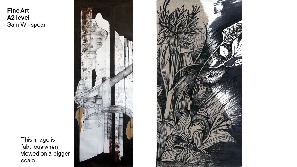
Sam Winspear
Sam Winspear

William Maidment 1
William Maidment
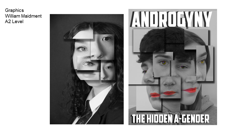
William Maidment 2
William Maidment